Bridging

Design

Development
Design isn’t just about looking good — it’s about guiding action, building trust, and communicating value in milliseconds

Bridging Design & Development
Designs and developments aren’t separate silos — they’re two sides of the same creative process. When these teams collaborate from the start, magic happens: visuals that are not just beautiful but built to perform. This blogs dives into how we approach projects with shared in language, mutual respect, and early alignment. We talk systems, spacing, dev-ready Figma files, and the power of thinking in components. We’ll also touch on how structured workflows reduce revisions, eliminate disconnect, and speed up the delivery. Because when design and dev constraints — and dev understands design intent — everyone wins.
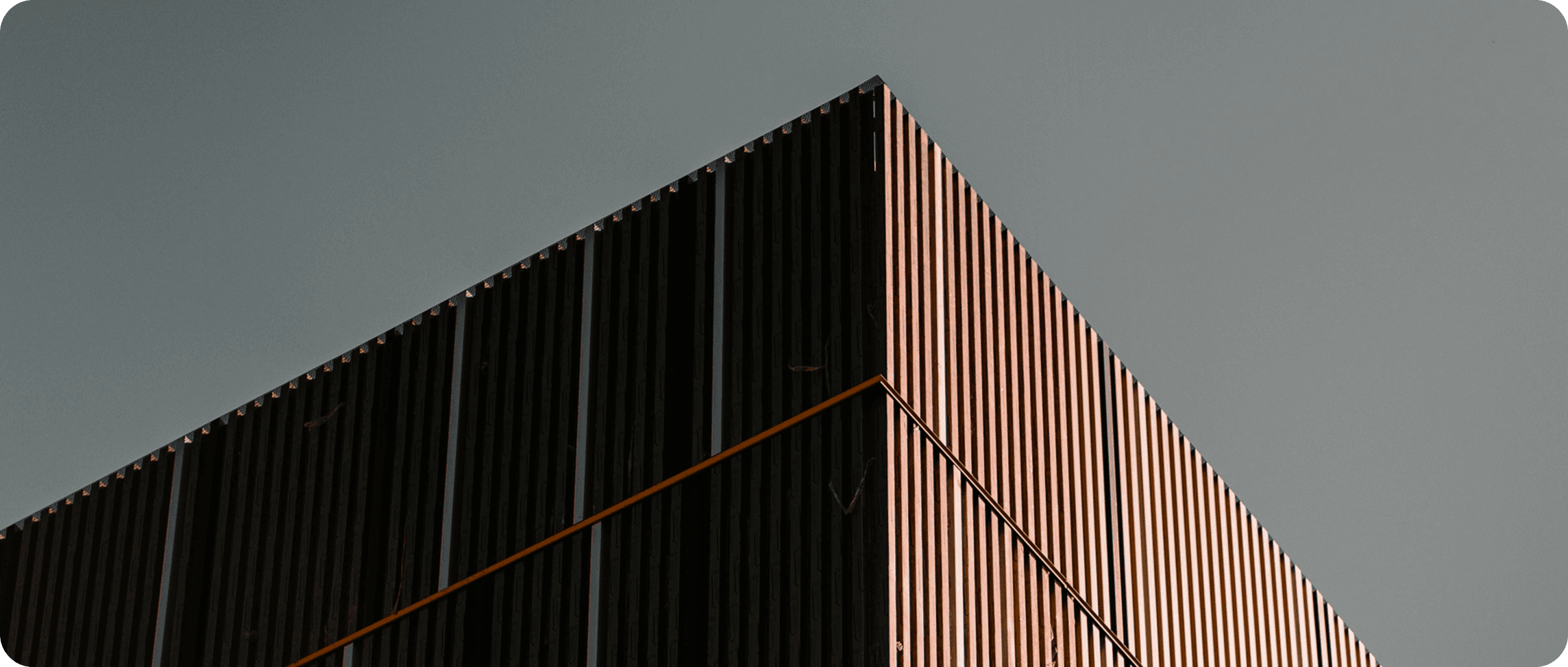
It became evident that their brand needed to be quiet, intelligent, and structured—mirroring the way they approach spatial design. We had a strategy around a concept we called “Architectural Presence”: a blend of clarity, restraint, and identity. This helped steer the direction for both branding and digital design decisions, setting a strong conceptual backbone for all creative work ahead.
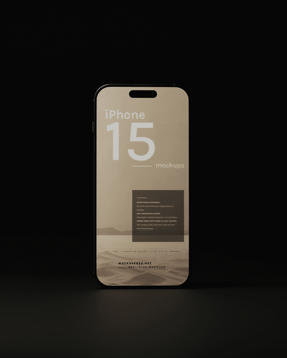
Website Design, Development
30th May 2025
Creation & Deliverables
This post is for the hybrids the ones who dream in color palettes but think in breakpoints. We explores what really happens when the meets real-world development. Too often, creative concepts get watered down during the build phase. But it doesn’t have to be that way. By using shared design systems, atomic components, and collaborative tools.
At the close of the project, we delivered a complete brand kit: logo suite, brand guidelines, stationery design, and fully editable Figma files for social and presentation materials. This ensured consistency whether they were pitching to clients, publishing a press feature, or sharing updates online. For the website, we handed over a clean Web flow build with documentation and a training session for their internal team. We also provided a backup Figma prototype, ensuring the design system could scale or migrate to other platforms in the future. The launch marked a new chapter for Archin—where design and communication finally spoke the same language.
Deploy & Deliverables
Let’s face it — the handoff is often the most painful part of any creative project. Designers hand off static screens; developers struggle to interpret intent. Things break. Expectation misalign. We’re over that. In this piece, we lay out how to create a truly seamless bridge between design and dev. It starts with structure: naming conventions, proper documentation.
We'll walk through the tools we use to automate specs, communicate states, and preview responsiveness. We’ll also dive into a real-time collaboration using tools like Webflow, Figma’s Dev Mode, and Notion-driven workflows. It’s about building habits that scale: clear tokens scalable typography systems, shared libraries, and a language both teams understand. By the end, you'll have a clearer path from idea to implementation — minus the friction, plus the flow.